 FACT CHECKED
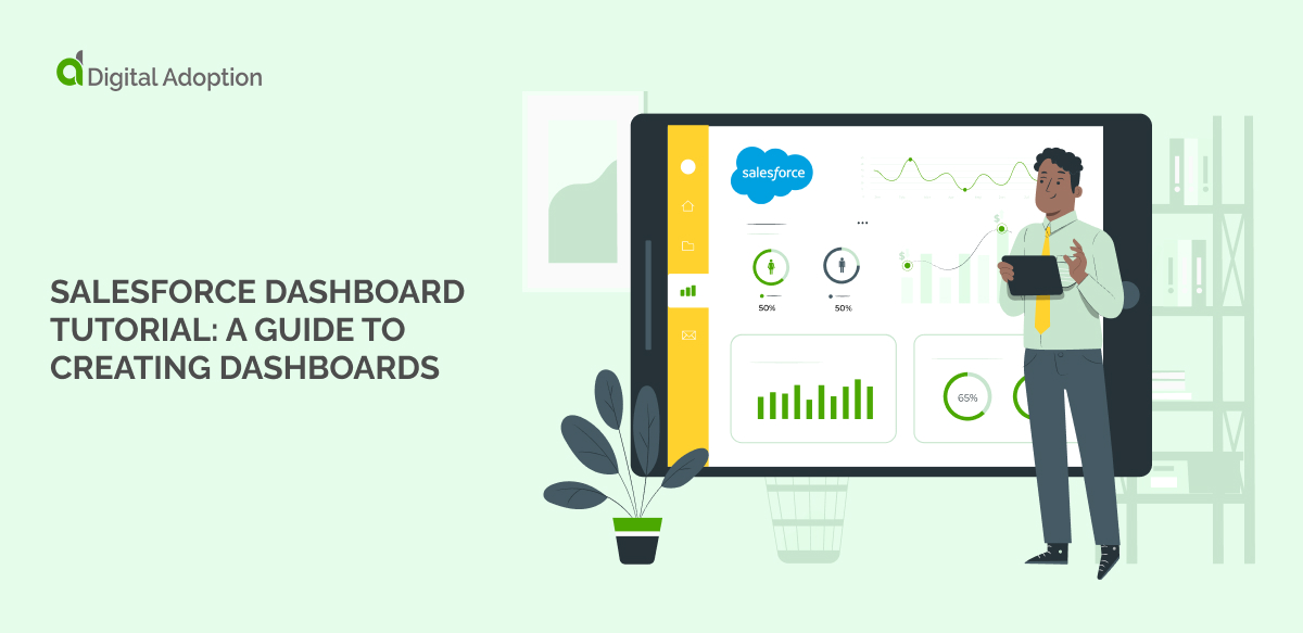
Salesforce Dashboards provide businesses with an invaluable solution for managing the increasing complexity of customer relationships and the data required to nurture them.
Dashboards are provisioned within Salesforce’s core solution and emerge as a prime resource in helping sales and marketing teams identify trends, sort out quantities, and measure the impact of relevant activities.
Salesforce emerged as the top CRM provider in the IDCs latest Worldwide Semiannual Software Tracker for the tenth consecutive year.
Salesforce’s Dashboard Builder enables users to transform bespoke or standard source reports backed by their wider Salesforce data model into graphical visualizations, charts, gauges, metrics, and other indicators for viewing key data.
Salesforce Dashboards provide businesses with a visual representation for enabling sales and marketing teams to track and understand changes in customer data more effectively.
As businesses undergo rapid digital transformation, adapting quickly and effectively is essential for success.
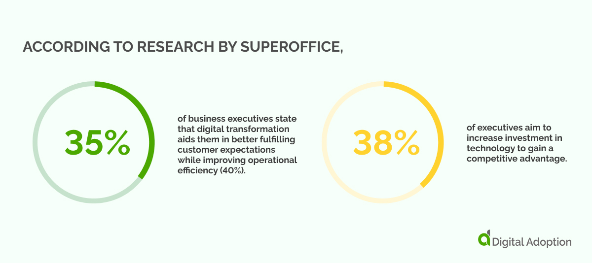
According to research by SuperOffice, 35% of business executives state that digital transformation aids them in better fulfilling customer expectations while improving operational efficiency (40%). Furthermore, 38% of executives aim to increase investment in technology to gain a competitive advantage.
Leveraging tools like Salesforce Dashboards and wider CRM solutions, companies can gather valuable data and insights, informing their digital adaptation strategies and driving innovation in an increasingly dynamic business arena.
In this tutorial, we’ll explore the capabilities of Salesforce Dashboards and provide a comprehensive guide on creating effective dashboards for sales and marketing teams. We’ll define what Salesforce Dashboard is, discuss its key features and components, and highlight its benefits.
With enhanced data visibility into leads and opportunities, sales and marketing representatives can make informed decisions and sell more intelligently, ultimately increasing the bottom line.
What is Salesforce Dashboard?
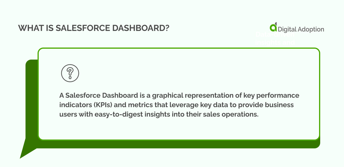
A Salesforce Dashboard is a graphical representation of key performance indicators (KPIs) and metrics that leverage key data to provide business users with easy-to-digest insights into their sales operations.
Dashboards can be customized to display information specific to a user or team’s role, enabling quick access to actionable insights and allowing users to monitor data and track progress toward goals in real time.
Dashboards are a core feature within the Salesforce CRM platform and are supported in both Salesforce Classic and Lightning Experience.
Some additional key information to note:
- Users can subscribe to a maximum of 7 reports or dashboards and be notified whenever conditions are met.
- Portal users cannot subscribe to a report.
- Each dashboard can support a maximum of 20 components.
- The same report can be used for one or multiple components.
- Dashboards can be viewed on desktop and mobile devices (available via the Salesforce mobile app).
- Dashboards can be shared with specific users or groups via email or link.
These features may be subject to change over time, according to Salesforce’s official documentation.
Dashboard components
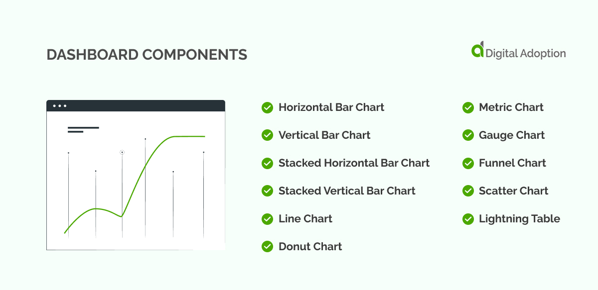
When creating a new dashboard widget, users are prompted to select components that will serve as key performance indicators (KPIs), graphs, charts, tables, metrics, and other important data points.
There are eleven unique component types to choose from, each tailored to meet specific data visualization needs:
- Horizontal Bar Chart
- Vertical Bar Chart
- Stacked Horizontal Bar Chart
- Stacked Vertical Bar Chart
- Line Chart
- Donut Chart
- Metric Chart
- Gauge Chart
- Funnel Chart
- Scatter Chart
- Lightning Table
If the source report already contains a chart, you can retain the chart settings by selecting “Use chart settings from the report.”
User friction can be reduced, and digital adoption can be increased by carefully selecting the right dashboard component. By segmenting modules based on unique data within source reports and the requirements of specific teams, users can ensure they only present the most relevant data in their dashboards.
For example, funnel charts visually represent how users move through stages to reach a goal, making them ideal for tracking sales pipelines and conversion rates. Similarly, metric charts allow users to track progress toward targets by displaying key metrics and indicators.
With the right selection of components, users can create highly effective dashboards that provide clear insight into business KPIs and performance metrics.
How to create a Salesforce Dashboard

-
Create Source Reports
Before launching your dashboard, it is important to ensure that the source reports contain all the necessary data fields needed in the dashboard and that teams are granted access and visibility.
For example, a single Prospect source report may include all the requirements needed to track the progress of leads through the sales funnel, such as lead source information, deal size, and win/loss rates.
To begin, you’ll need to identify the key metrics and data points you want to track on your dashboard. This might include sales pipeline progress, conversion rates, or customer acquisition costs. Once you know what data you need, you can create source reports that pull that information from your Salesforce instance.
Businesses can create effective dashboards that provide unobstructed cross-visibility by selecting the right data sources and granting access to relevant teams.
-
Set up the Dashboard
Once you have secured and created your source reports, it’s time to set up your Salesforce dashboard. This is where you will visualize and analyze the source reports’ data, providing valuable insights into your business performance.
To create a new dashboard, navigate to the Dashboards tab in Salesforce and click the “New Dashboard” button. You’ll be prompted to select a dashboard-type and layout from there. The type you choose will depend on the data you want to visualize, while the design will determine how that data is arranged on the dashboard.
You can add components to your dashboard once you’ve selected a type and layout. As we mentioned, it’s important to consider carefully which elements you want to use and how they will contribute to your overall analysis.
As you add components to your dashboard, you can customize them to further refine your visualizations. This might involve selecting different data fields, adjusting chart colors and styles, or setting up filters to focus on specific subsets of data.
Begin visual data sharing
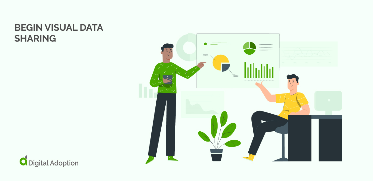
Once you’ve set up your Salesforce dashboard, the next step is to let the visual data sharing begin. This is where your dashboard will be shared with relevant teams and stakeholders, providing them with valuable insights.
One way to share your dashboard is by using Salesforce’s sharing settings. This allows you to grant access to specific users or groups within your organization, ensuring everyone can access the same data and analysis. You can also set up sharing rules to automatically grant access based on predefined criteria like role or geography.
Regardless of how you share your dashboard, it’s important to consider your audience and tailor your analysis accordingly. For example, if you’re sharing your dashboard with a sales team, you might want to focus on metrics such as pipeline progress and win rates. Alternatively, if you’re sharing with executives, you might want to emphasize high-level KPIs like revenue growth or customer acquisition costs.
Add the finishing touches
There are a few final things to note when setting up your Salesforce Dashboard, such as refining the user experience (UX). Refining the UX is often given little afterthought once a Salesforce dashboard is created.
In addition to effectively selecting and visualizing the right data, you must ensure that your dashboard is engaging, intuitive, and easy to use. One way to do this is by customizing the design with different colors and fonts, adding images or logos, or incorporating interactive elements.
Those who require further assistance can check out Salesforce’s
Lightning Design System provides developers with the guidance to create customized dashboards, including chart components and responsive layouts, ensuring consistency across their applications.
Dynamic Dashboards
Dynamic dashboards are a powerful tool for creating Salesforce dashboards that we can’t forget to mention before concluding this tutorial.
Dynamic Dashboards’ unique features allow admins to control sensitive data access while providing users the insights they need to make informed decisions.
Admins can monitor user behavior closely and prevent potential data leaks or other security risks by setting up secure, customized dashboards that cater to individual user needs.
To create a dynamic dashboard, select the components you want to include. These might consist of charts, tables, or gauges, each providing a unique way of visualizing your data. You should also consider how you want to allow users to filter or adjust the dashboard, using options like drop-down menus, checkboxes, or radio buttons.
Once you’ve selected your components and filtering options, you can build your dashboard’s dynamic functionality. This involves setting up rules or logic determining how the dashboard should adjust based on user inputs. For example, you might set up rules that modify the dashboard based on geographic location, account type, or sales stage.
It’s important to consider the security implications of dynamic dashboards. By allowing users to customize their dashboards, you may expose sensitive data or open the door to data leaks or other security risks. To mitigate these risks, it’s important to carefully control access to dynamic dashboards and monitor user behavior closely.
Realizing the Benefits of Salesforce Dashboards
In summary, Salesforce’s Dashboard solution can function as a primary source of information for numerous team’s on their Salesforce journey. On the one hand, it offers sales teams valuable insights for designing a sales funnel dashboard that provides a birds-eye view of where opportunities and prospects are in the sales cycle.
Similarly, marketers can use the same report to create dashboards that track engagement metrics, funnel progression, and campaign performance, allowing them to make decisions and optimize their marketing strategies underpinned by data.
Reports provide important information but can be overwhelming and difficult to understand when presented as tables. Luckily, dashboards offer a more intuitive and visually pleasing way to display data from reports. This allows users to personalize the presentation format that best suits their needs.
The ubiquity of Salesforce CRM across sectors means most sales and marketing teams will likely be familiar with their solutions and understand the benefits gained when becoming proficient in using the technology.
Considered the de-facto CRM solution for companies across industries, Salesforce is the top vendor in the global market for customer relationship management (CRM) software, holding a market share of 23.8% in 2021, according to Statista.
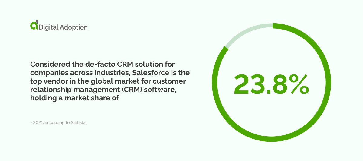
Salesforce leads the market by a significant margin, outpacing competitors such as SAP, Microsoft, and Oracle, holding around five percent shares.


")

