 FACT CHECKED
A tooltip is a display of text or information that appears when users interact with a screen component, i.e., buttons, icons, menus, and images—typically by positioning their cursor or hovering over the click target.
It’s a key graphical user interface (GUI) feature that supports seamless user experiences (UX) by providing contextual hints, additional details, or explanations without requiring an external page visit.
In a business climate characterized by widespread digital disruption, the pace at which employees are expected to navigate and become familiar with new technology is increasing rapidly.
Through tooltips, training programs, digital adoption platforms (DAPs), and other various learning and development (L&D) resources, businesses can help users overcome the learning curve of new technology adoption and drive true transformation.
This article explores tooltips, first defining what they are and how they’re used. We’ll also check out their benefits and walk you through creating a basic tooltip – complete with an example.
What are tooltips?
A tooltip is a graphical user interface (GUI) component that triggers the appearance of a text or information box when users position the cursor or hover over the clickable target. This could include links, buttons, icons, menus, images, and other interactive page elements.
This assistive guidance is vital in enhancing user experiences (UX) by offering contextual hints, supplementary details, or explanations, i.e., a description of a tool function. A tooltip may sometimes be called ‘hover text’, ‘info pop-up’, or ‘interactive cue’.
On mobile devices, tooltips work slightly differently to desktop solutions, displaying these tips through long-press or tapping and holding the click target, as opposed to hovering over the element with a cursor on desktop.
The inception of tooltips traces back to the early days of graphical user interfaces, with Microsoft playing a pivotal role in their integration. Notably, Microsoft introduced ScreenTips, a form of tooltips that provided users with contextual information when hovering over certain elements.
Mac OS—post system 7, incorporated the tooltips feature “Balloon Help” to enhance user guidance, providing contextual information through brief explanations when users hovered over specific elements.
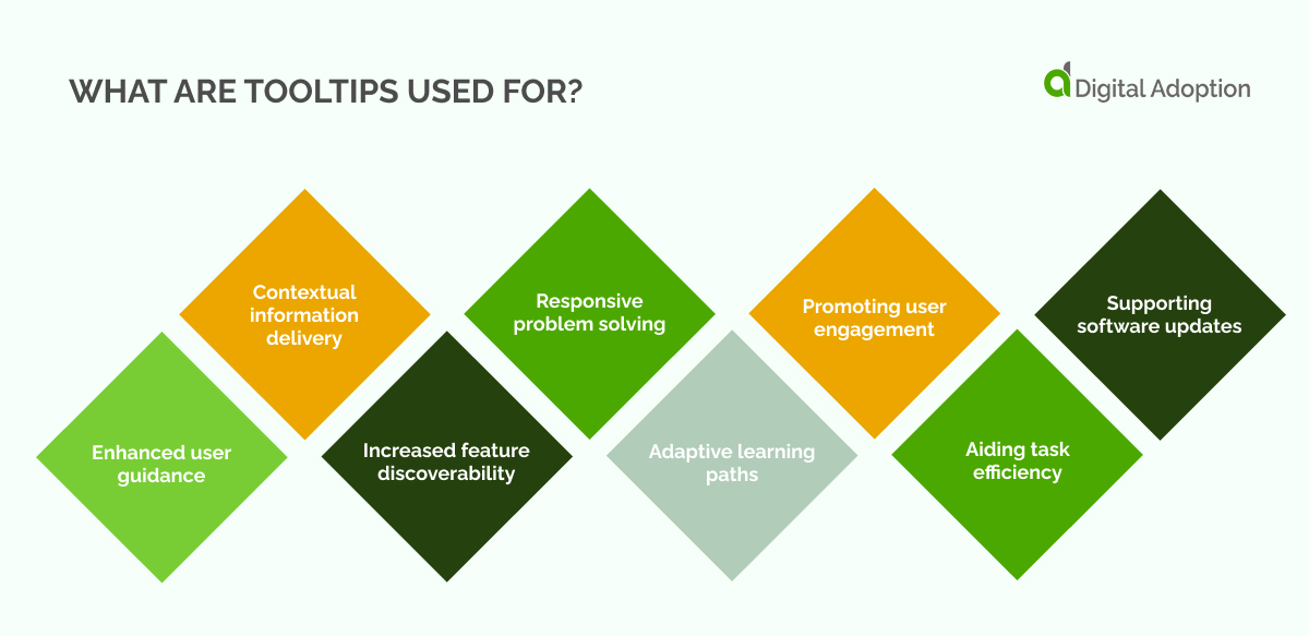
What are tooltips used for?
Tooltips primarily facilitate the onboarding of new users, offering feature tutorials and interactive tours that lead them through the essential functionalities of the product’s user interface.
Below, we explore other major ways tooltips are used and how they can assist in addressing today’s tech adoption challenges – especially for those undertaking fast-paced digital adoption efforts.
- Enhanced user guidance
Tooltips serve as navigational aids, providing users with real-time guidance on interacting with specific elements, reducing confusion, and streamlining their overall experience.
- Contextual information delivery
They offer contextual information, delivering relevant details about buttons, icons, or menu options precisely when users need it, ensuring a more informed and efficient interaction.
- Increased feature discoverability
Tooltips highlight lesser-known features, maximizing the chances of users discovering and utilizing functionalities they might overlook during regular exploration.
- Responsive problem solving
In instances of errors or misunderstandings, tooltips can dynamically address issues by offering instant clarification or solutions, minimizing potential frustration, and supporting inquiries.
- Adaptive learning paths
For ongoing education, tooltips can be strategically employed to introduce users to advanced features gradually, adapting the learning curve to the user’s pace and proficiency level.
- Promoting user engagement
Interactive tooltips engage users actively, fostering a sense of participation and making the learning process more engaging and enjoyable.
- Aiding task efficiency
By providing quick insights or shortcuts, tooltips contribute to task efficiency, allowing users to accomplish actions more swiftly without the need for extensive navigation or trial-and-error.
- Supporting software updates
Tooltips prove invaluable during software updates or interface changes, ensuring users swiftly adapt to new features or modifications without disrupting their workflow.
What are the benefits of using tooltips?
The digital-first ethos currently emanating across organizations and their respective industries increasingly necessitates a push toward transformation.
The feverish undertaking of these efforts, however, often fails–where the aim of driving sustained value is quickly replaced with the need for solutions that remedy poor tech adoption, failed investments, and a culture resistant to change.
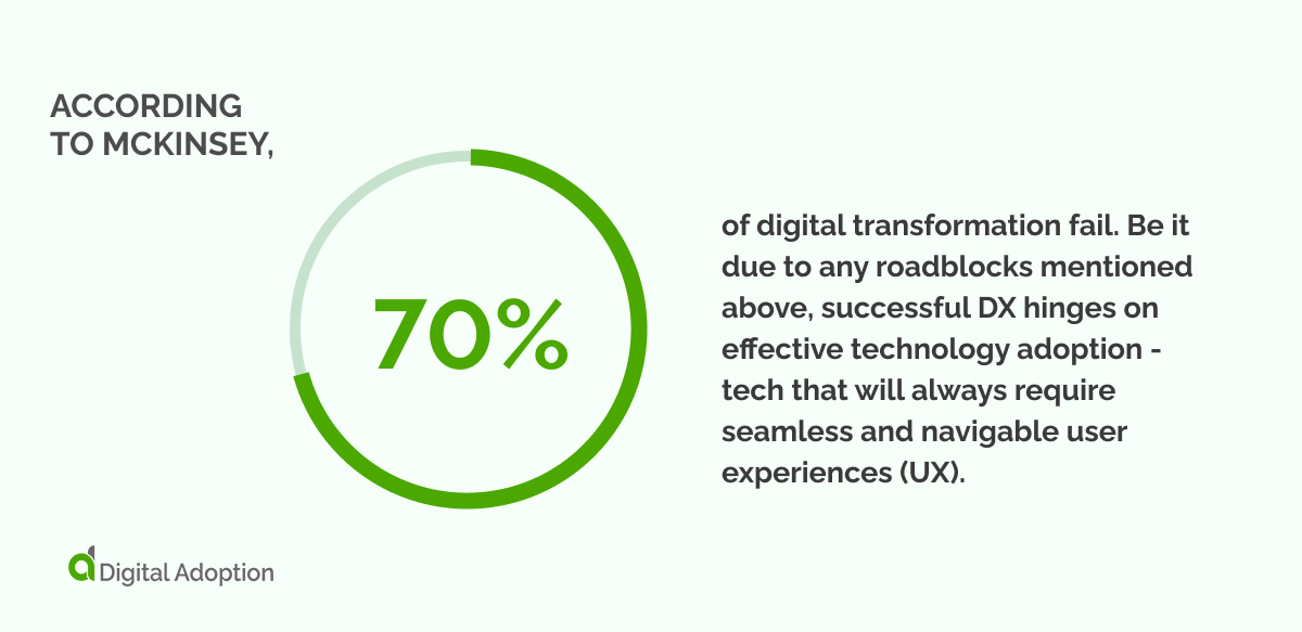
According to McKinsey, 70% of digital transformation fail. Be it due to any roadblocks mentioned above, successful DX hinges on effective technology adoption – tech that will always require seamless and navigable user experiences (UX).
Modern software and apps will often leverage seamless UI design in the form of tooltips, providing a comprehensive solution that takes most of the leg work out of onboarding and training new users.
Companies may also deploy a digital adoption platform (DAP) to address similar roadblocks, such as facilitating onboarding. DAPs, however, go beyond tooltips by providing a broader range of features, including interactive guidance, task automation, and analytics to help organizations optimize software adoption and usage.
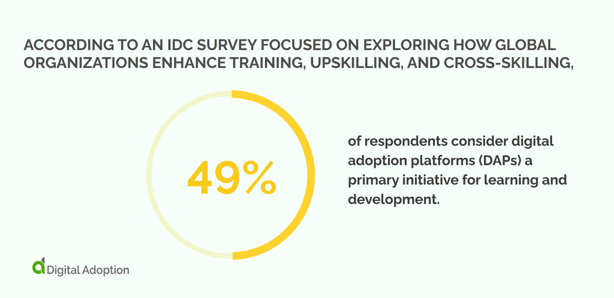
According to an IDC Survey focused on exploring how global organizations enhance training, upskilling, and cross-skilling, 49% of respondents consider digital adoption platforms (DAPs) a primary initiative for learning and development.
How to create a simple tooltip
Below, we’ve provided an example of creating a basic tooltip using HTML and CSS. This code, or front-end code, is a key ingredient in GUI design and will determine how the website or app product looks and behaves.
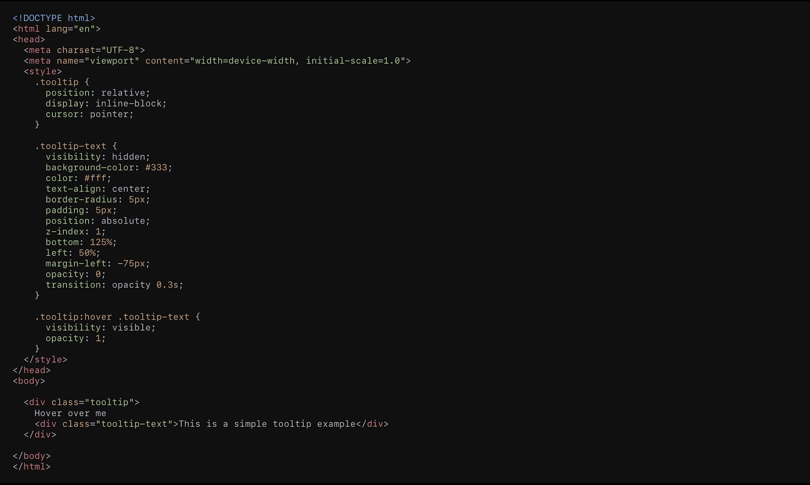
Tooltip example explained
The magic starts with `<div class=”tooltip”>,` your trigger.
This could be a word, an icon, or anything you want users to hover over for extra info.

When users hover over “Hover over me,” voila, the tooltip appears.
All the juicy details are tucked inside `<div class=”tooltip-text”>` with the text “This is a simple tooltip example.” This is where you spill the beans with the information you want to share.
The CSS styles play the role of the fashion designer for our tooltip, making sure it looks slick and is easy on the eyes.
- The box is set up nicely with `position: relative;` and `display: inline-block;` like arranging furniture in a room.
- The cursor does a little dance, changing to a pointer with `cursor: pointer;`, giving a subtle hint that there’s something interactive here.
No one likes abrupt appearances. The tooltip gracefully enters the scene with a fade-in effect (`opacity: 0;`, `transition: opacity 0.3s;`) when users hover over the trigger. It’s like a VIP entrance, smooth and classy.
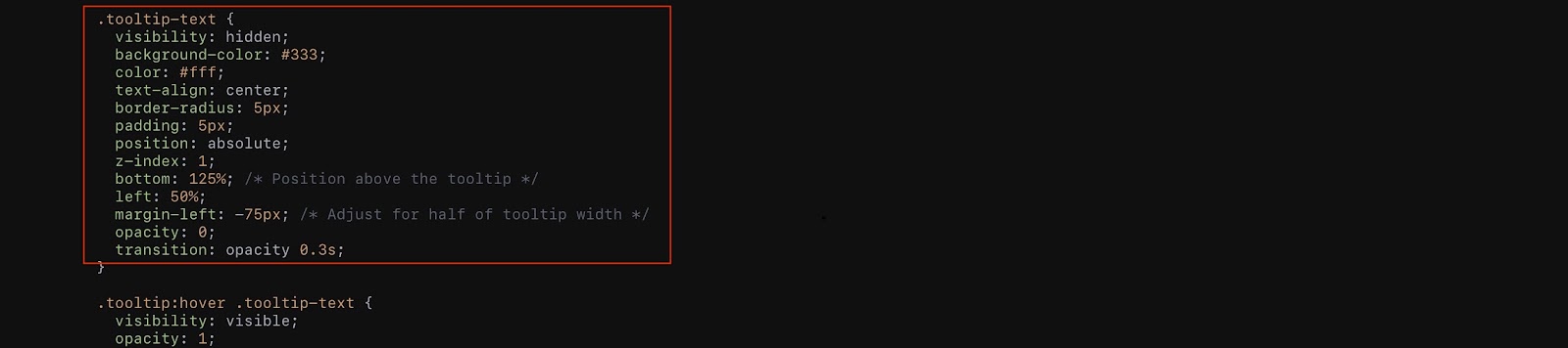
The tooltip gets a makeover with a dark background, white text, and rounded corners – you can customize this section to match your brand theme.
Thanks to the meta tags in the head section (`<meta name=”viewport” content=”width=device-width, initial-scale=1.0″>`), our tooltip is like a superhero with the ability to look good on various devices.

It adapts to different screen sizes, ensuring a consistent and delightful experience.
You can easily tweak the tooltip by changing the text inside `<div class=”tooltip-text”>` to match your content.
Play around with the styles in the CSS section to give it the vibe of your website.
In a nutshell, this code lays the groundwork for a user-friendly tooltip that’s like a helpful friend, providing extra info without stealing the spotlight from your main web page content.
Coding tooltips from the ground up, however, can prove complex without the help of dedicated development teams willing to put aside time to craft the tooltip code.
With time better spent maintaining essential functionalities or addressing high-priority development tasks, try exploring pre-built tooltip libraries, leveraging existing frameworks, or adopting third-party solutions to expedite the implementation process and maintain a focus on core development objectives.
Optimizing tooltips for seamless user experiences
For tooltips that seamlessly integrate into a user interface and enhance the overall experience, it’s vital to adhere to three fundamental principles: Clarity, Context, and Unobtrusiveness.
- Clarity: Each tooltip should serve a distinct purpose, providing concise and relevant information. Avoid overcrowding with excessive details, ensuring users easily grasp the intended message.
- Context: The content within a tooltip should align closely with the user’s action or the element it accompanies. A tooltip loses effectiveness if it doesn’t provide context or if the information isn’t directly related to the user’s current task.
- Unobtrusiveness: Tooltips should enhance the user experience without causing disruption. Strive for subtlety—deploy tooltips that appear and disappear smoothly, allowing users to access additional information without feeling overwhelmed or distracted.
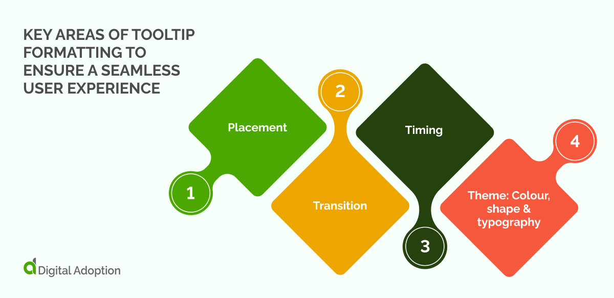
With these principles as a foundation, let’s explore key areas of tooltip formatting to ensure a seamless user experience:
- Placement
Carefully position tooltips near relevant elements to guide user attention. Balanced proximity and non-intrusiveness are essential, ensuring tooltips aid comprehension without obstructing the user’s view.
- Transition
Incorporate gentle transitions, like a gradual fade-in and out (`transition: opacity 0.3s;`), to create a polished effect. Smooth transitions prevent jarring appearances, creating a more fluid and less disruptive interaction.
- Timing
Introduce tooltips with a slight delay after the user hovers, avoiding an immediate pop-up. This timing strikes a delicate balance, offering timely information without causing irritation or impatience.
- Theme: Colour, shape & typography
- Consistent color palette: Choose colors that harmonize with the overall theme, ensuring tooltips =seamlessly blend into the website’s visual identity.
- Balanced shape selection: Opt for shapes that align with the design language—rounded corners (`border-radius: 5px;`) for a softer look or square tooltips for a more modern aesthetic.
- Readability-focused typography: Demonstrate legibility by selecting clear, readable fonts. Maintain a cohesive typography style across the interface to establish visual continuity.
Driving digital adoption: a tooltip approach
We’ve explored why and when tooltips need to be implemented, along with exploring their benefits and an example of how to create basic code.
By this point, readers should understand how tooltips are a key component in facilitating strong user experiences (UX), shortening the time-to-value of a product, and driving adoption for new and existing users.
According to data provided by Precision Reports (via LinkedIn), the global Digital Transformation market, valued at $503.32 billion in 2021, is expected to grow to $1.35 trillion by 2027. This represents an average Compound Annual Growth Rate (CAGR) of 17.94%, indicating investments and interest in nascent tech solutions aren’t slowing.
With accelerated user adoption rates a major indicator of digital transformation success, achieving this level of change (particularly in times of acute transformation) can prove a constant uphill battle for business leaders.
Learning and development support in the form of tooltips, software training programs, and DAPs ultimately mitigate user drop-off, increase user retention, and ensure adoption efforts run smoothly.
Well-crafted tooltips should encourage user interactions and assist users over learning curves, not just during onboarding but throughout the entire product lifecycle.
They should thread seamlessly through the user interface and mitigate obstacles that disrupt the user journey, ultimately contributing to a more intuitive and efficient digital experience.


